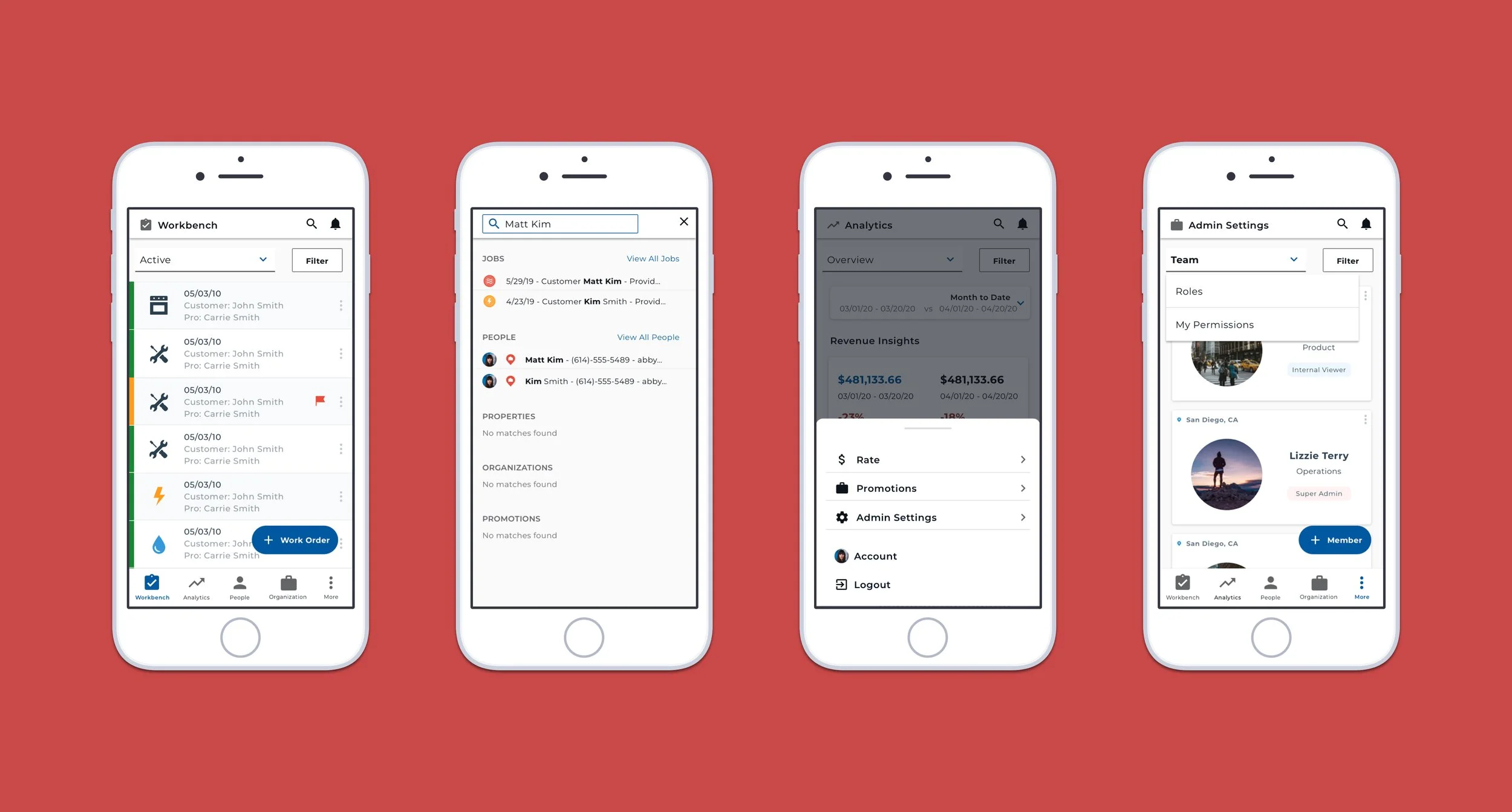
HOMEE: Workbench Mobile
HOMEE allows skilled tradesmen to take jobs instantly and earn money for the time they work, and in turn connects property managers and homeowners with ease of availability.
Role: Internship - 2020
Dispatchers for workers use Workbench, a summary of jobs that are updated as tasks are completed. A glaring issue with the application was that it lacked mobile responsitivity.
Problem
Outcome
Using a combination of the HOMEE component library and user testing, another in-house designer and I designed and tested concepts for mobile navigation. This redesign was pushed to dispatcher’s accounts at the end of 2020.
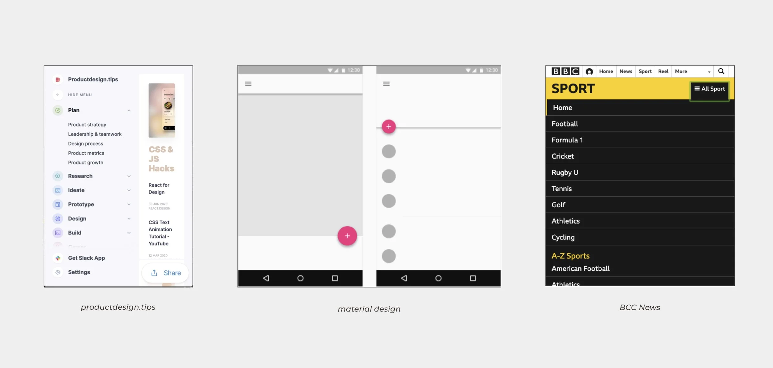
Before ideating, I benchmarked what other apps existed that organized a robust navigation. In particular, I took note of Material Design’s mobile navigation solutions.
Benchmarking
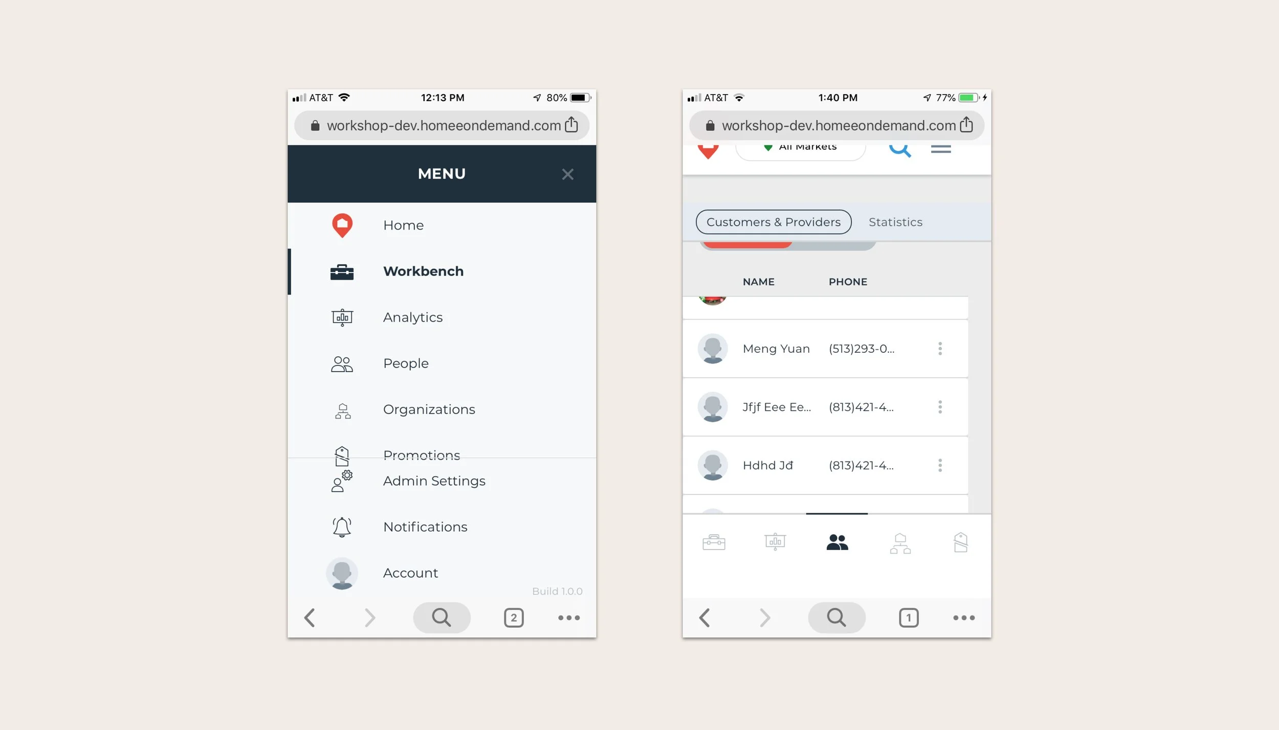
When opening Workbench on a mobile device, the navigation breaks entirely, making it virtually impossible to complete tasks.
Original Navigation
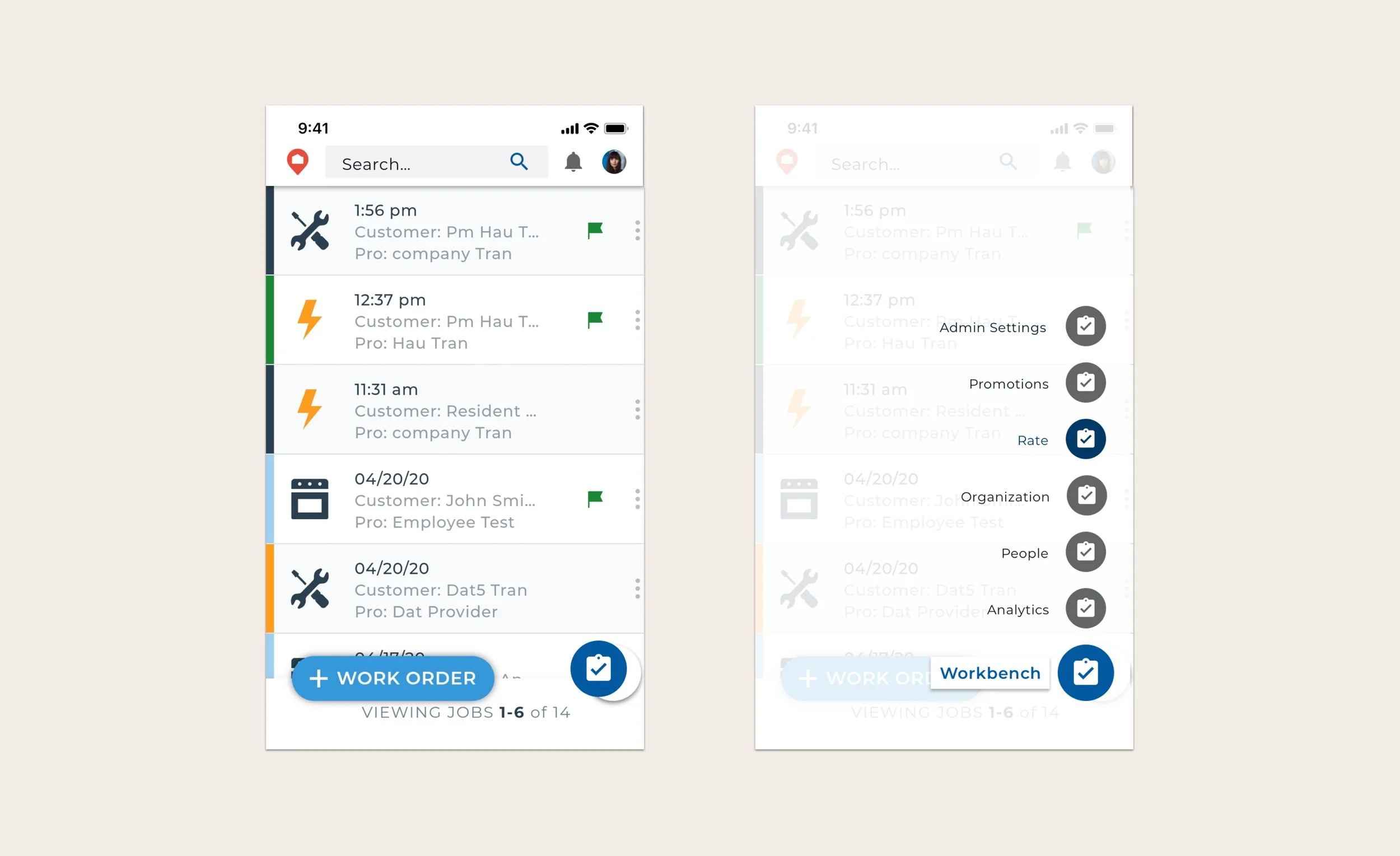
I explored icon-based navigation and a tab menu in order to organize layers of information. I also combined these in to a single solution.
Explorations
I assisted in carrying out 10 remote user tests, with the required tasks being to navigate to the analytics tab to find a point of data, search for a specific worker, then log out.
I employed a “think out loud” structure, allowing the user to navigate themselves through the process without direct intervention. Some pitfalls included finding menu iterations, particularly the log out section. Successful completion and speed of tasks scored highest in the bottom drawer menu and top search navigation design.
User Testing
Prototype
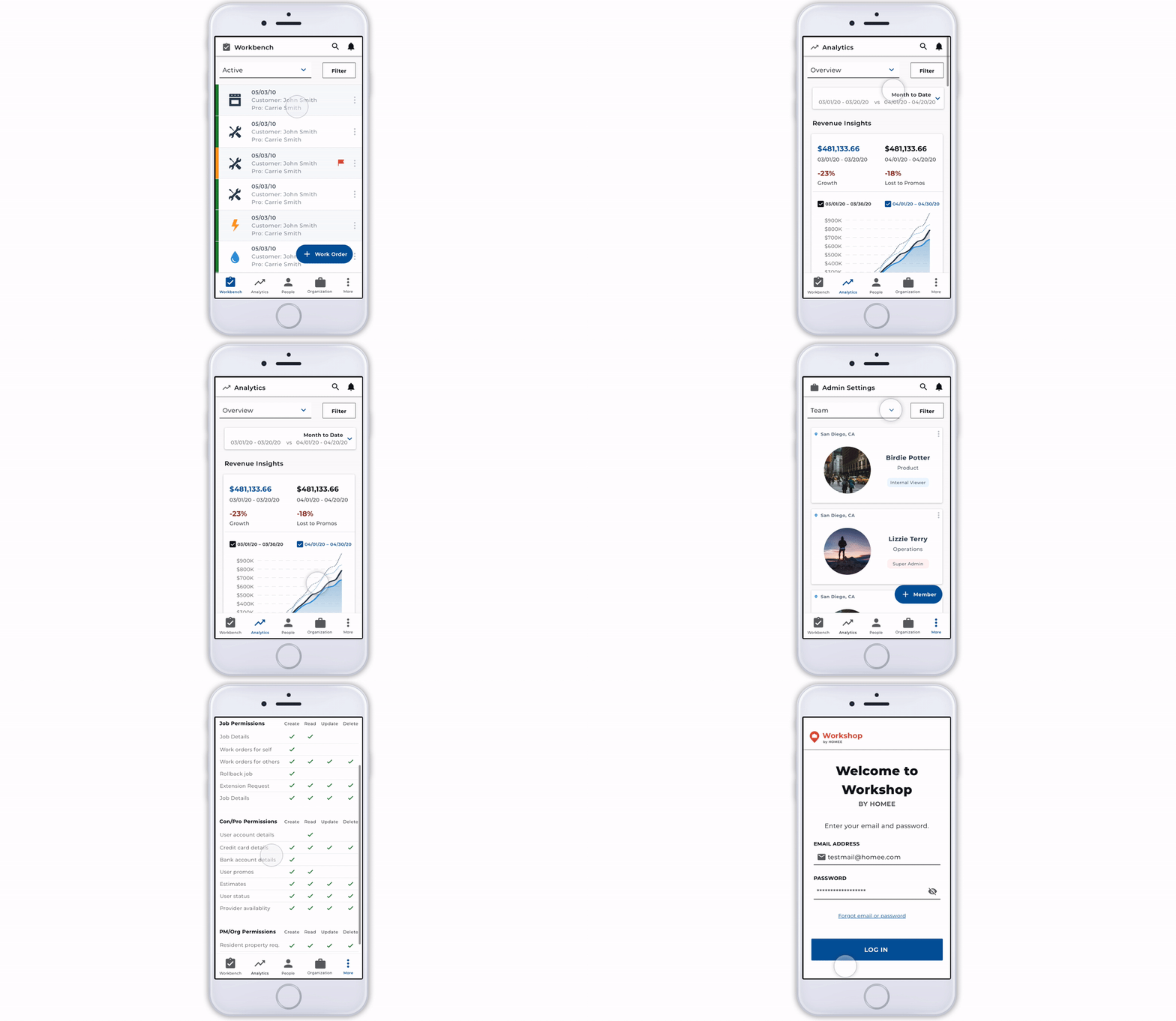
Final Screens
While this wasn’t something that I built entirely from scratch, getting the chance to work with a previously existing design system sped up the creative workflow by allowing me to play with previously built blocks. This was also one of my earlier introductions to remote user testing.

